Your website is your most valuable marketing asset. In this day and age, if you don’t have a decent looking site that is easy to navigate and has an enquiry form for bookings (as opposed to live bookings) then you are already behind the times. If your site is more than 5 years old, it’s time for a refresh or a whole new site. While it can be daunting, here are few tips on how to create a website that converts.
Make it trackable
Make sure you have Google Analytics on your site. Why do anything if you can’t track it? It also means that you can try new things and see whether they work or not and highlight any issues quickly. If Analytics is too much to wrap your head around, you can do a course online or hire an external agency to set it up for you and teach you how to navigate it (and to email you reports each month).
Make sure your website is easily found.
Do not have the philosophy of “if you build it they will come” as this is a surefire way to failure.
You need to think about every single page on you site and it’s optimisation and how it will be found in search. A great article detailing it further can be found here.
Summarised for you includes:
- Ensuring your loading times are fast
- Include subject in title tag
- Include subject in URL
- Creating high-quality, relevant content for your customers
- Making sure you’re backlinking to great authority
- Include subject in image alt text
- Specify subject several times throughout text content
- Include 1-2 long-tail keywords each time you create content and make sure they appear in your headings, metadata and images (long tail keywords that your customers would type into search for example “where to get a photo with a Koala in Sydney” if you are an attraction or tour that offers this experience)
Make great user experience a top priority
Once your customers have found you, you want to make sure they can get the information they need quickly - and without feeling overwhelmed. Be disciplined and keep your home page clean and simple. You don’t need all the information about your tour sitting on the homepage, you just need to intrigue them and invite them to click through. You can do this by:
- keeping your language short, simple and relatable
- ensure your call to action (booking button) is front and on every page. Once your customers decide what tour they want to book, make it as easy as possible for them to!
- not overloading the homepage with too much multi-media content
- making sure the web design is consistent with your branding.
- Make sure it’s mobile optimised - the growth of mobile bookings is only increasing - it’s a reality that customers research and book via mobile nowadays, so this is a no brainer.
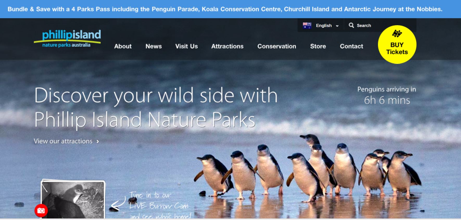
A great example of this is Phillip Island Nature Parks - as you can see they have included the “Buy Tickets” is attached to their header to customers can easily book from any page they are on.

In conclusion
Follow these few tips and your website should be taking bookings in no time. The more direct bookings you take = no commissions so higher margins. Remember your website is your most valuable marketing asset so investment (time and money) is crucial to ensure it performs at its maximum earning potential.


Comments