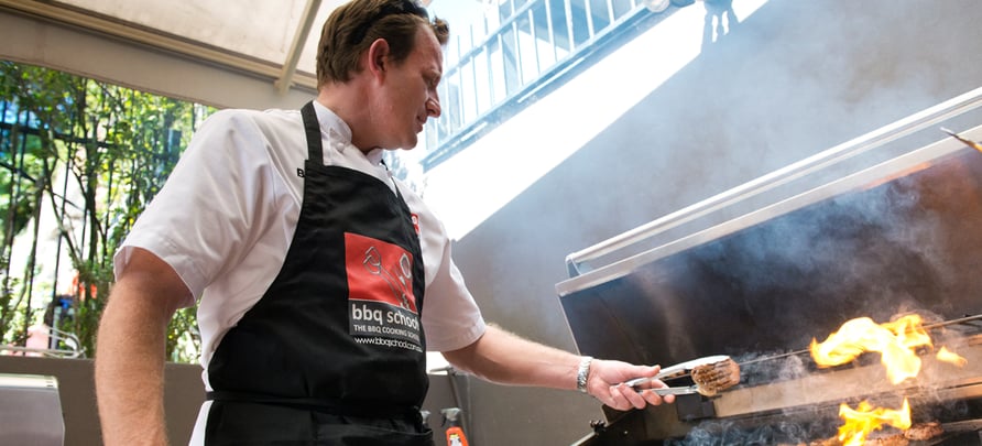
Imagery is an essential part of selling. In tourism marketing, the way we use images to portray our tour or activity offering could make all the difference between securing a booking or not. Let’s be honest, as tourism and activity operators we have some of the best snapshot moments to share. We’re a lucky bunch. But should we be using those images? Or should we be getting stock images? Does our image selection matter? Does it matter if the baby is crying? Or if we took the images from social media?
In this blog post we will take a look at the four most important aspects of choosing imagery that is a true reflection of your brand.
1. Is it relevant?
Every time you embark on creating any kind of marketing collateral, from a website or brochure, to flyers and expo booths, the images you choose need to be relevant. It’s a no brainer if you run a bungee jumping attraction in Australia, you wouldn’t choose pictures of people bungee jumping in New Zealand. You also wouldn’t use a picture of kids eating ice cream.
Images that are irrelevant or portray the wrong experience don’t strengthen your brand. They offer distractions and weaken it. Pick images that reflect what your customers can expect from booking with you. To example again, of course use images of people bungee jumping at your attraction. But you could also get a happy snap of your staff smiling and enjoying their jobs. Or get a shot of staff strapping someone in. If you have the budget, get creative and use a drone and get an image of the jump site from above and offer a bird's eye view. Why not grab a snap of your jumpers straight after getting off the bungee giving a big ol’ thumbs up? There are so many options.
2. Does it convey the right emotions?
Images help make a customer anticipate and desire being in that perfect moment. The emotions your picture conveys should represent your brand and experience. Joy and excitement are definitely the emotions people associate the most with touring and travel. From surfing at Bondi Beach to taking a cooking class in the Sydney CBD, it's usually all happy faces and images of people enjoying themselves and it does make sense in this context. But if you own a ghost tour or run a haunted house attraction, you want the images to convey nervous excitement or fear.
But it’s not just facial expressions that convey emotions in images, it’s also the images lighting, tone and colourings.
Back-Roads Touring Co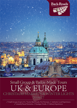
Back-Roads Touring Co is a tour company offering tailor-made touring holidays for small groups. Their tours are exclusive and their target market is people between 40 and 70. The business succeeds in creating a sense of luxury through their well-chosen color palette of their imagery.
Back-Roads’ ‘UK & Europe Christmas Markets & Winter Lights’ catalogue is a great example. It uses evocative images that draw the audience in and create a sense of longing and Wanderlust.
The front cover has a picturesque image of snow falling on Vienna. While the images main colouring is dark, which conveys it’s cold, there are certain parts of the city which have been lit up more than others, making it appear welcoming at warm. Been dreaming of a white Christmas? This is the place for you. I can see myself sitting inside a room watching the snowfall with a cup of hot chocolate in hand, can you?
Looking through the rest of the brochure you can see the way lighting and other editing techniques have been used in all the images to create a sense of warmth, homeliness and even romance.
3. Is it unique and does it wow?
Stock images might seem like an easy and convenient choice - because they are - but they’re not the best choice for your brand. Travellers want to experience unique things to enrich their lives. Unfortunately stock images are not the best way to convey this.
It is absolutely worth spending a decent amount of money on an experienced photographer to come on your tour, or to your activity, and take snapshots of the exact experience your company is offering. Your contract should stipulate you own the rights to your photos and that you can use them in any way you want. And if you’re using images with people in them, ensure you get them to sign an image release form so you can use their image in your marketing material.
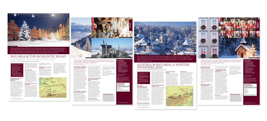
Example: Let’s take another look at the Back-Roads brochure. They opted to use only professional photos, with minimal people, that are a far cry from being overused stock images. Again, this reflects Back-Roads’ exclusive brand appeal and strikes the right chord with their target market.
If you are organising international tours and don't have the funds to hire a professional photographer to join the tour, it's possible to contact local photographers to take pictures at some of the tour highlights. This way your images are still unique, but you don't have to pay the travel costs for a photographer coming along for the entire tour.
Not every brand needs to spend a lot of money on unique images. Our customer Ocean Eco Adventure recently had a huge success with one of their own images going viral on social media. Depending on your target market, your traveller's might be your best source of images. Brands aimed at younger people could even consider using images from travellers personal social media sites - with their permission of course. Anything unique, relevant and on brand can be a great option.
4. Does it reflect your branding colour and is it consistent?
Your brand’s colours are what differentiates you from the crowd. They also say a lot about the message you’re trying to convey to your target market. As we’ve seen, Back-Roads use a rich burgundy theme which provides a sense of luxury. You can just tell by looking at their marketing collateral and website this you’re in for an exclusive experience with all the top-shelf extras. They have also altered the tone of their images to match in well with their burgundy branding.
Intrepid
Intrepid, a world-wide touring company promising unique experiences, tells a different story. Intrepid caters to a mixed range of travellers, from the basic backpacker to a holiday maker looking for a something off the beaten track without having to compromise on comfort. Their images reflect their own branding, but each region in which they offer a tour in has a unique colour pallet that’s representative of that part of the world.
For example, their Australia brochure has a big focus on orange and red which stems from the colouring of Uluru. Their stunning Europe guide has a focus on blue and white - instantly the customer is in Santorini or exploring Middle Eastern delights in Turkey.
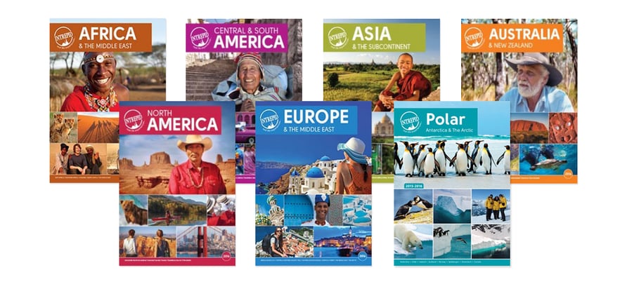
Their catalogues use an eclectic mix of professional images of their travellers enjoying the experience, as well as close-ups of locals they met on their travels and scenic wide pan shots. Every single image is bright, fun and consistently reflects their branding.
While it has a unique theme colour you know it’s Intrepid’s tour at a quick glance. Their branding colours hone in on the rich local cultures you will experience on their tours.
A final piece of advice
Branding is a critical part of any company’s identity. Your images must reflect your branding if you want to attract the right target market for your tour. It pays to do in-depth brand research to find out what works best for your audience. The four questions outlined in this article should be revisited every time you commission a photo shoot or pick images for your marketing collateral.
Now that we’re coming into the low season it’s a great time to work on your branding, and to make sure the content you’re producing - from your brochures to your blogs - reflects the target market you’re trying to attract. To learn more download Booking Boss’ 7-step action plan for tour operators and make the most of this low season.
Booking Boss is an online booking system for tour operators and attraction providers. Trusted by many in the tourism industry, Booking Boss is about getting you out of the spreadsheets and into the sun. We provide free education resources for operators like you, to make your business the best it can possibly be.




Comments